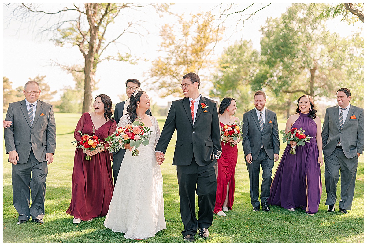
Understanding something complicated is always immensely easier when you break it down into its core parts. Then you can see how it comes together and know how it works. Photography can be complicated, but I’ve found that the same principle applies in learning how to be a better photographer. Photography, like all other art, can be broken down into the elements of design. They are the reason that art works – that when you look at a piece of art and just love it you can always find these elements of design within it. So this is why when I first started learning about photography in high school my teacher started us off by learning the elements of design and pointing them out in photographs and the environment around us. Then I remember our tedious assignments of taking pictures representing each of those elements. At the time I just wanted to take pictures of the things I loved, which was landscapes and portrait photography. But I learned as I became more aware of these elements, they greatly influenced my composition, exposure, and vision for each of my images. And to this day I still think about them as I take pictures!
So I decided to put together this two part series on the elements of design to help encourage others in their picture taking, as well. Being aware of these elements is so helpful in obtaining the images you want most! And these don’t just apply to photography, you can use these in web design, in painting, sculpture, or any other form of art.
In the first part I talked about the elements of line, scale, color, repetition, and negative space, which you can revisit here.
The first one I wanted to look at today is symmetry. Symmetry is like a breath of fresh air in an image, it gives it a sense of calmness and completion. Symmetry is basically giving the image the same thing on either side. The image below has symmetry because of the walking path and bridge which are the same on both sides of the image. I tend to look for symmetry in architecture, especially, but it can be found anywhere!
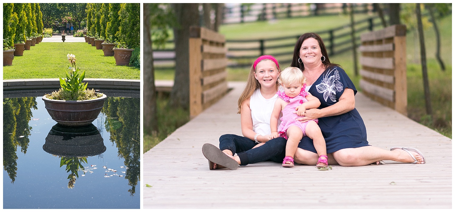
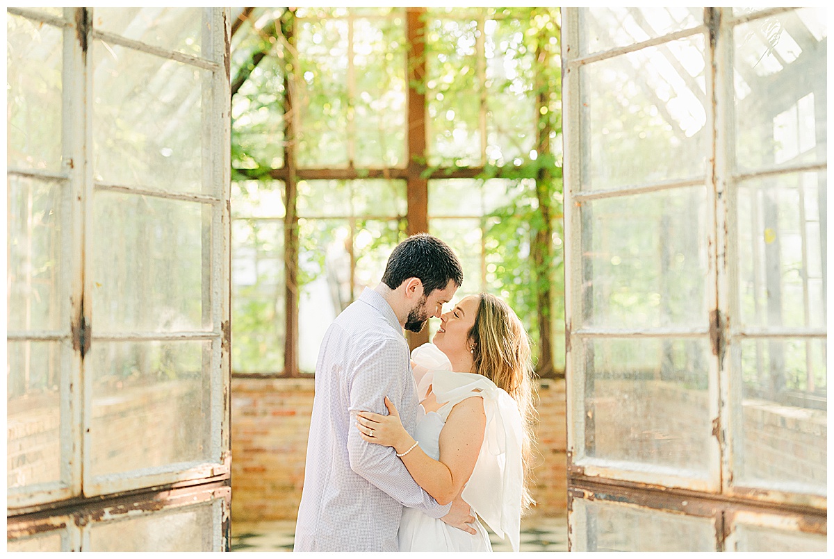
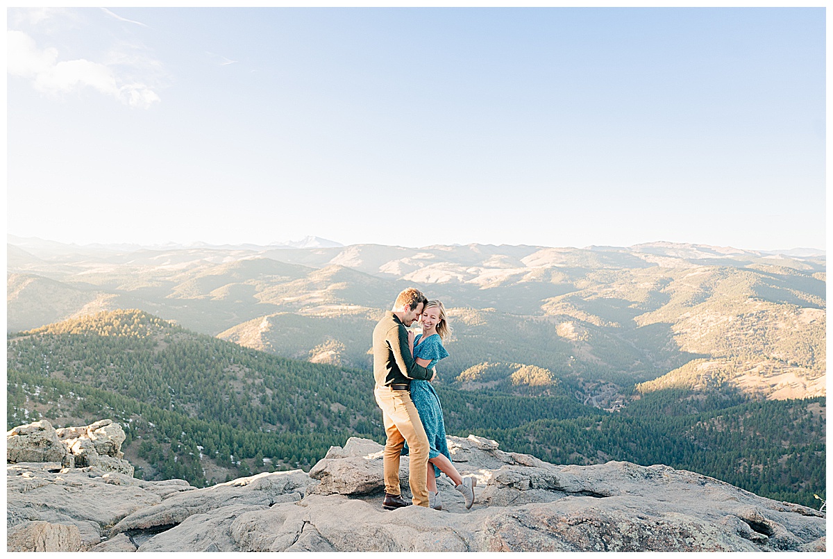
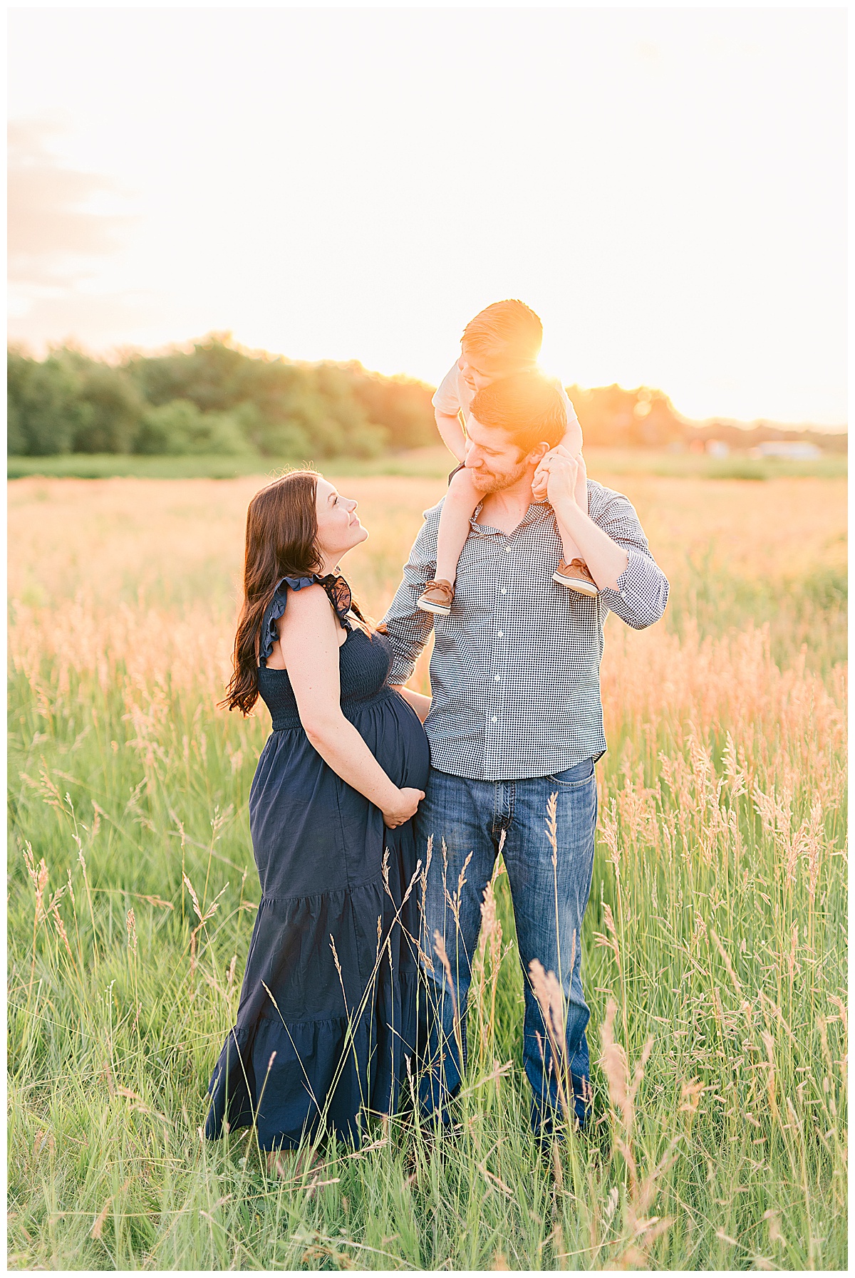
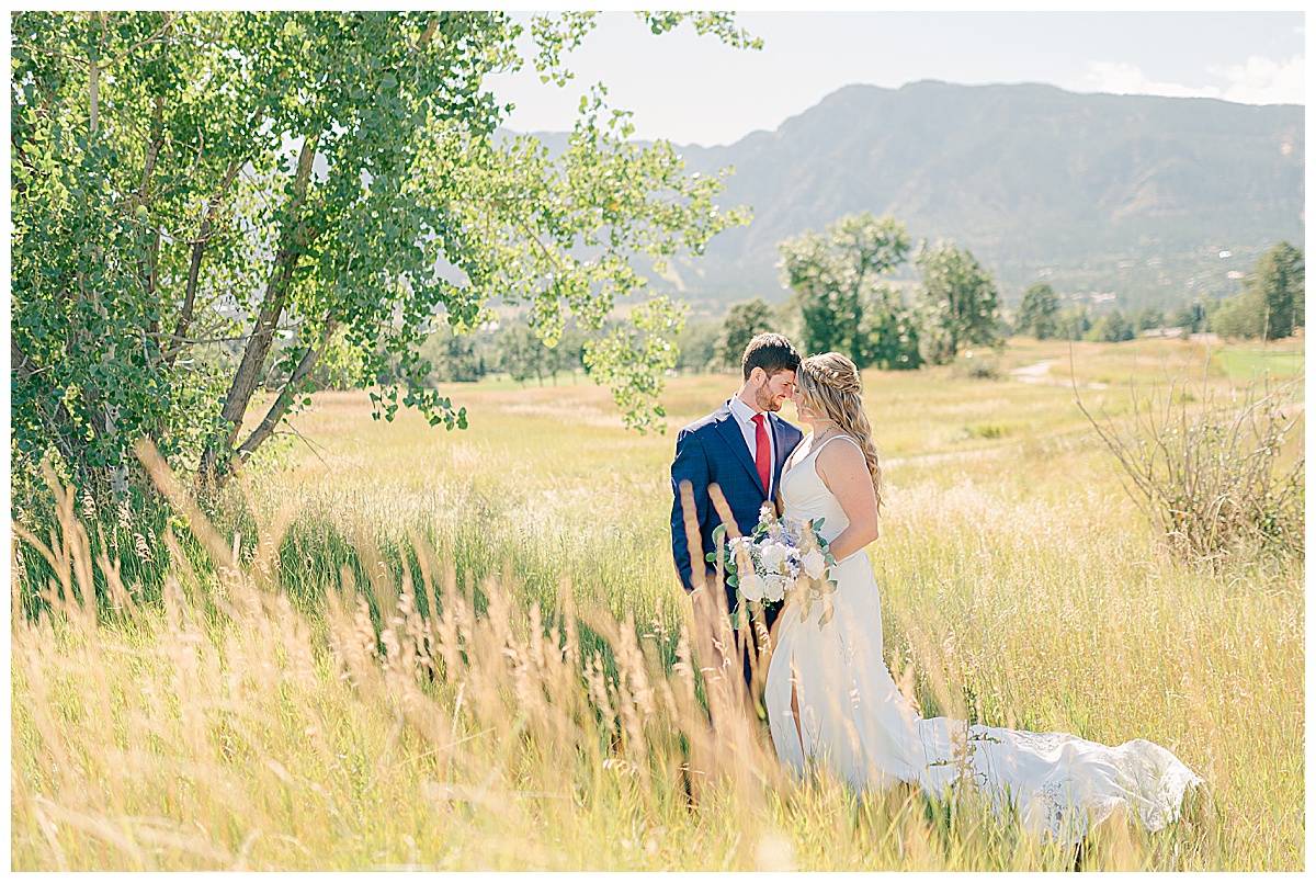
Another element of design I love to use is framing. Using something in an image to frame your subjects helps to add visual interest and lead the viewer to what you intend. In the images below you can see how different elements are used to draw attention to the subjects.
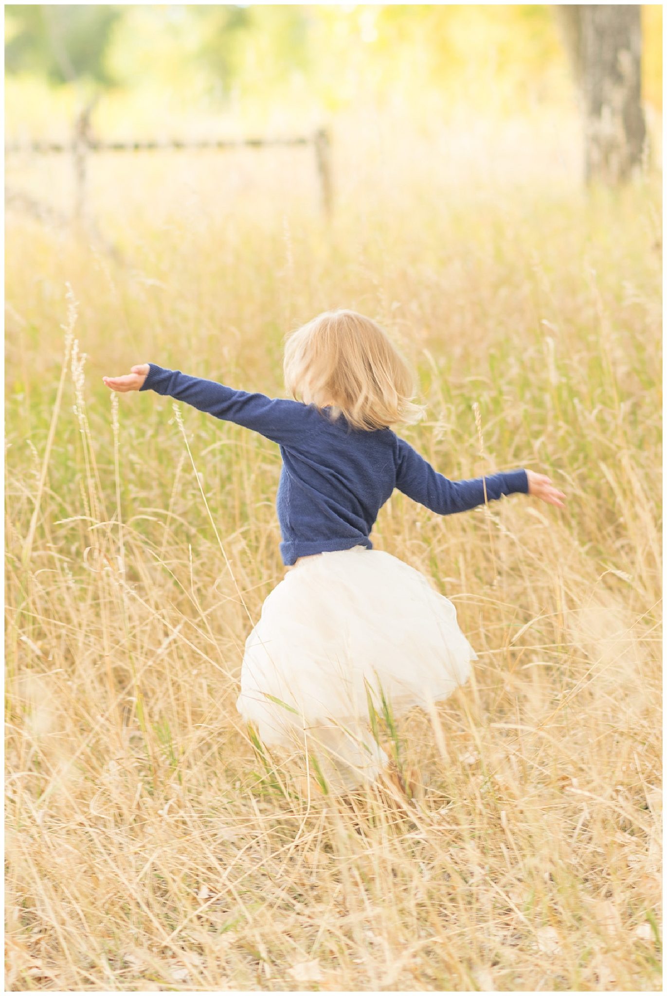
 Movement is always a fun element to try and capture in portraits. You can use movement to direct the viewer’s eye or simply to add visual interest to an image. I love the way that movement can help to tell a story in a portrait.
And finally when an image has depth (that is it shows a variety of shadows and distance), it creates a place for the viewer’s eye to focus. I always think of black and white portraits when I think of adding depth and value, but it can always be full color, too!  Hopefully these have inspired you a little bit! Next time you pick up your camera (whether its a phone or an SLR) think about emphasizing just one of these! And I would love to see them, too!
