Back in High School is when my love of photography first started in my photography classes. Mr. Berkun was not of great stature, in fact he was even shorter than my 5 ft 5 in self, but he sure earned my respect during my 4 years as his pupil. I had so much fun being prompted to stretch myself in different areas – areas I never would have thought of otherwise. To this day one of the things that has always stuck with me is the list of the elements of design. These are relevant in any art form, and Mr. Berkun made us describe how each of our pictures we presented used one of these elements. In doing this it forced us to be intentional about our picture taking, and not to simply take pictures of something we liked. So now days when I get in a rut or feel a little stuck, I remind myself of these elements to help encourage new creativity. I thought I would share them with you to help you think of your own picture taking! I do not share these as any sort of expert, but rather a student of them constantly learning myself. So come learn and be stretched along with me!
The element of line is the first one that always comes to mind. Its an amazingly powerful tool to bring life and interest to a picture. It gives a sense of movement and interest and will direct the viewer to a certain spot in your picture.
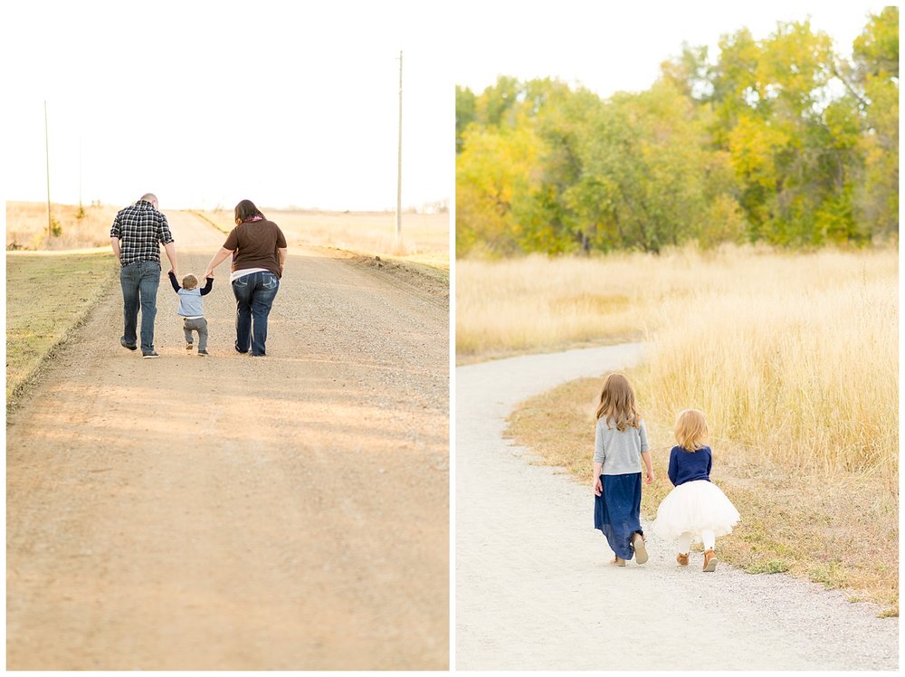 The converging lines in the left picture draws your eyes to the subjects in the center. The “S” curved line from the trail in the right picture draws your eyes through the frame and directs you to the subjects walking alongside the line.
The second element is scale. It draws your attention to certain things more than others and adds visual interest when things are different sizes.
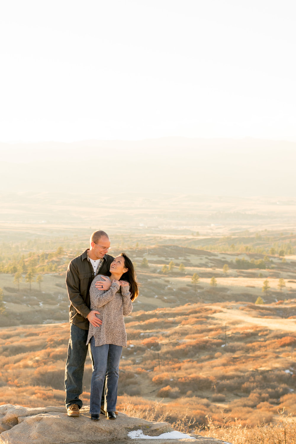 In this picture you can see how the subjects are vastly different in size compared to the backdrop. It draws the viewers attention immediately to John and Tanya.
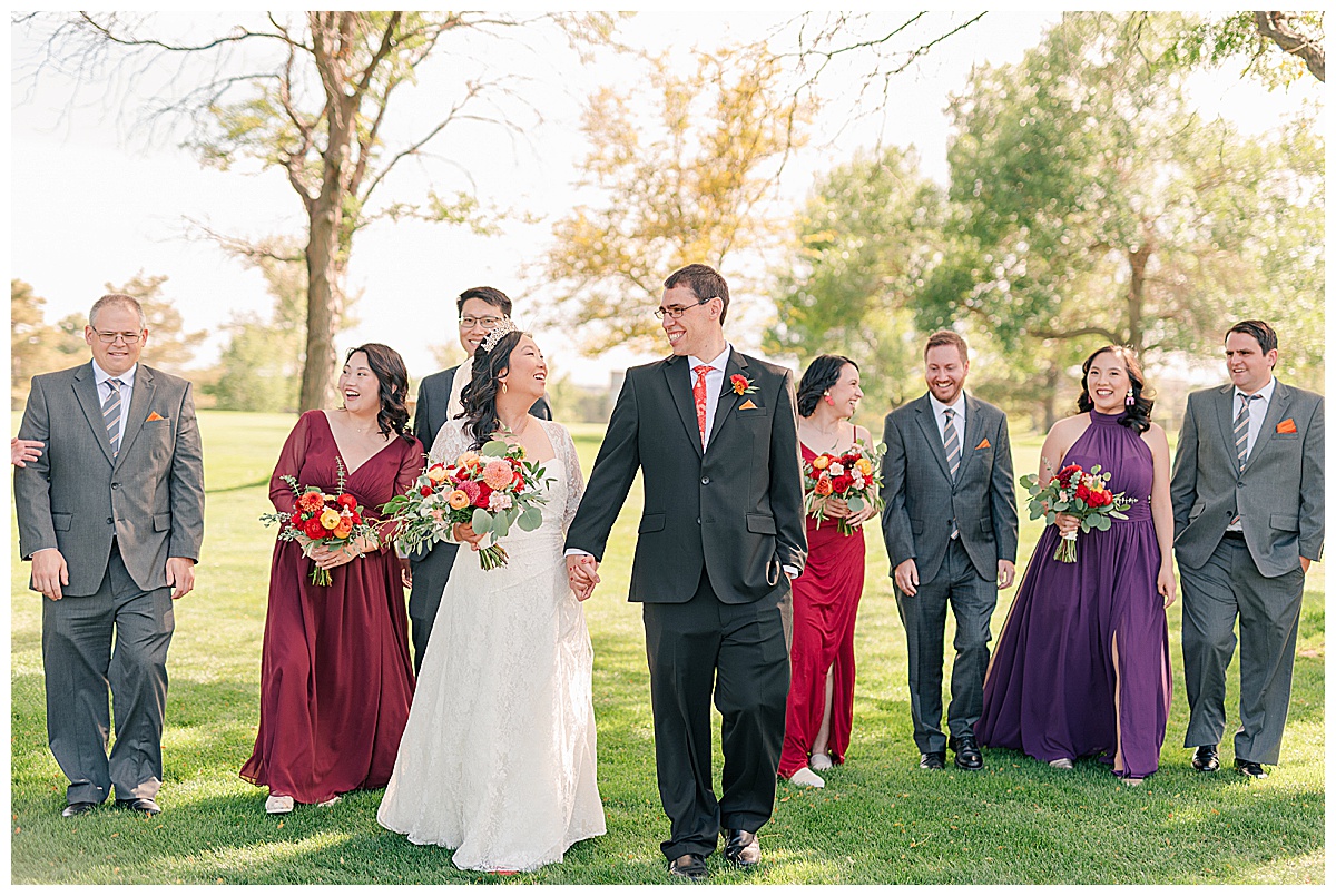
Using color to direct the eye and add interest is also lots of fun. This is one area I would really like to practice in. Strong colors or contrasts between colors can draw your eye into a picture. Also anytime complementary colors are used together makes a statement, as well.
 The pops of red in these two portraits make a statement – they draw your eye to them. Of course you can use any color to do this, but bright colors definitely stand out!
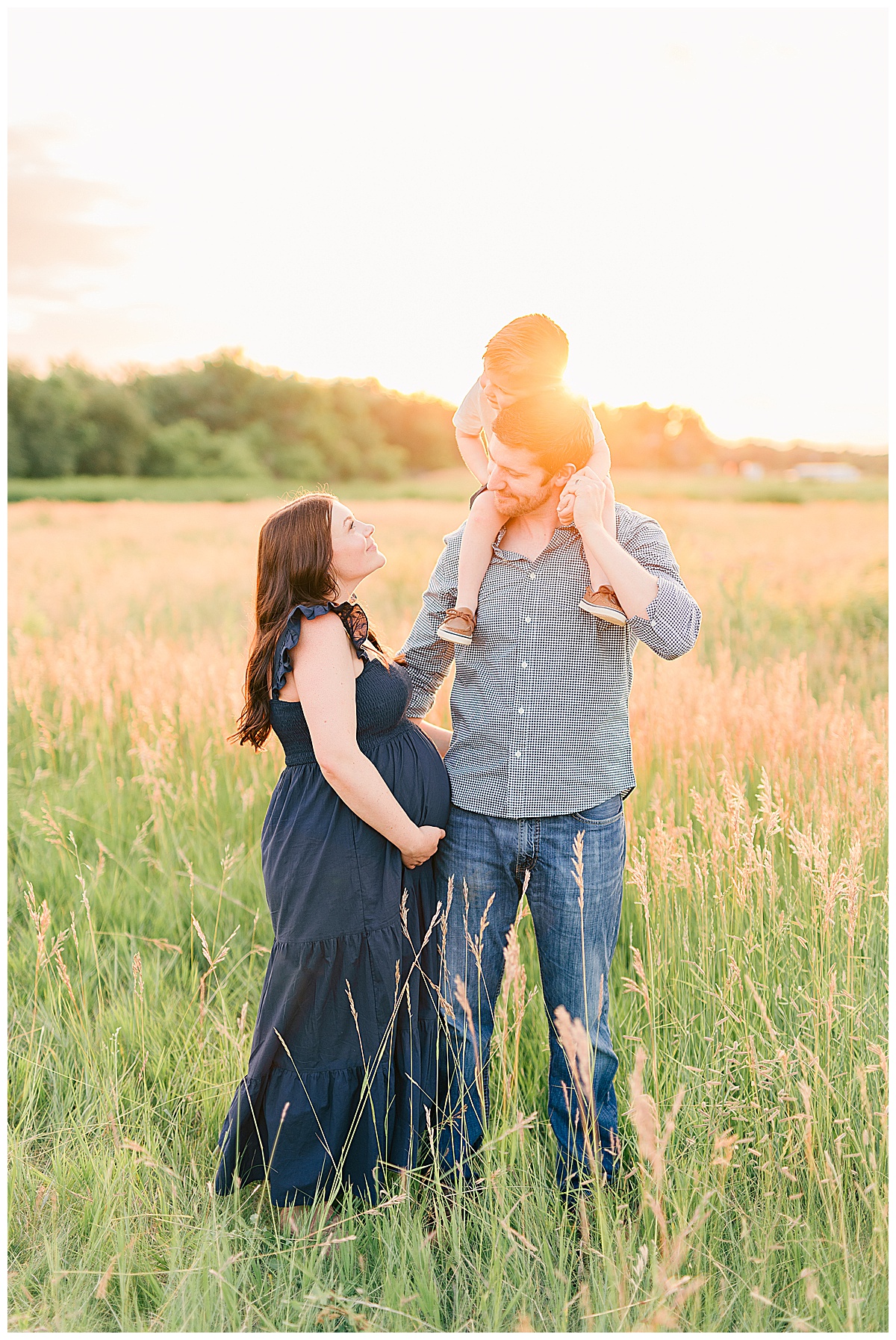
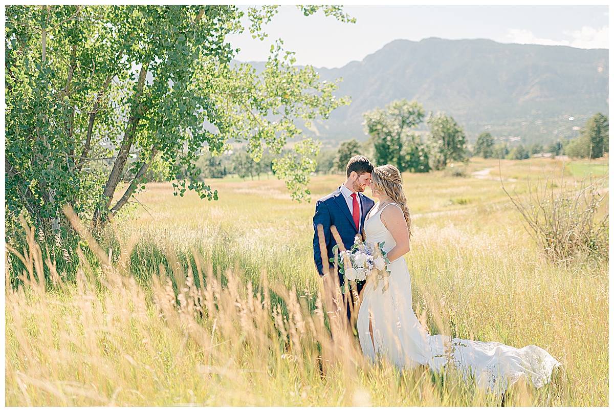
Repetition is one my favorite elements to use! I feel like my eye is always drawn to patterns and repetitions I see in my environment. It can make your subject stand out and make your picture a lot more interesting to look at!
 The repetition of not only the yellow flowers but the blades of grass create a backdrop that allows the subjects to pop off the background.
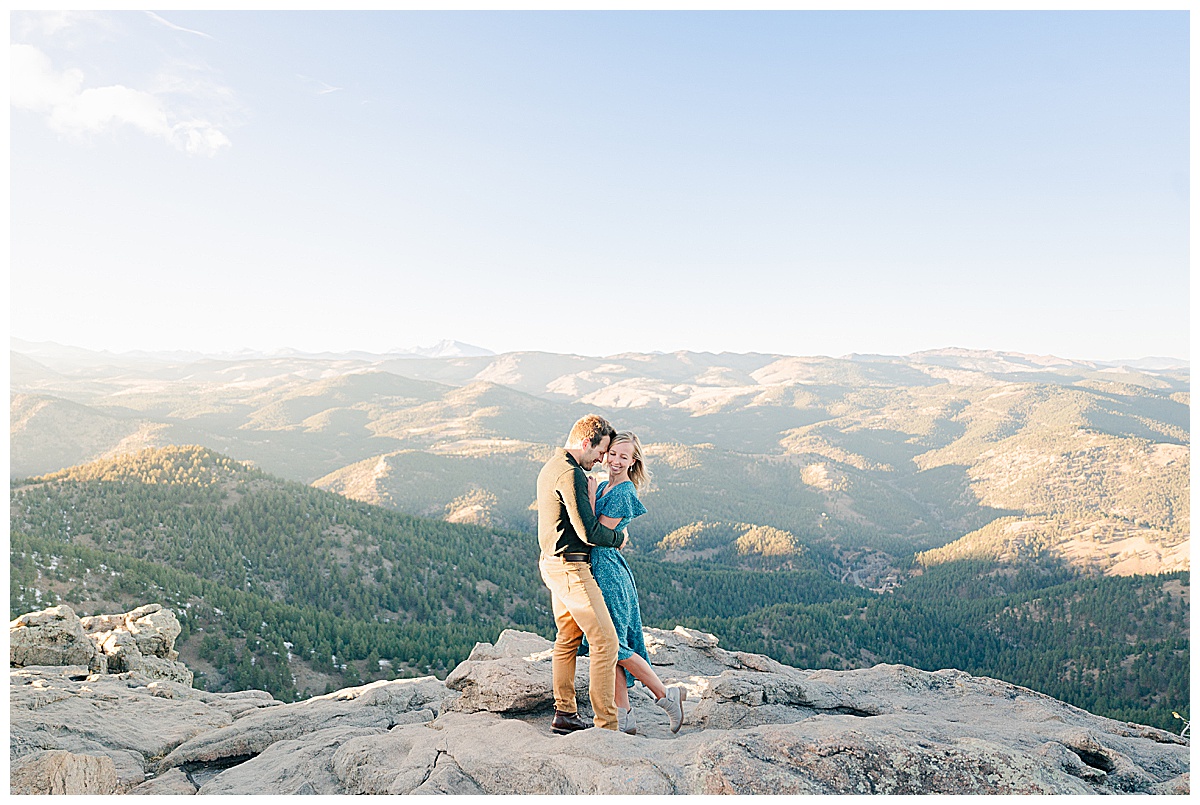
Having negative space, that space in between, is another design element. Sometimes you don’t know why a space looks better with some emptiness. Like hanging pictures on the wall, or looking at a magazine when there is a good deal of white space on a page – the negative space creates a balance and draws your attention where its wanted. And the same is true for pictures!
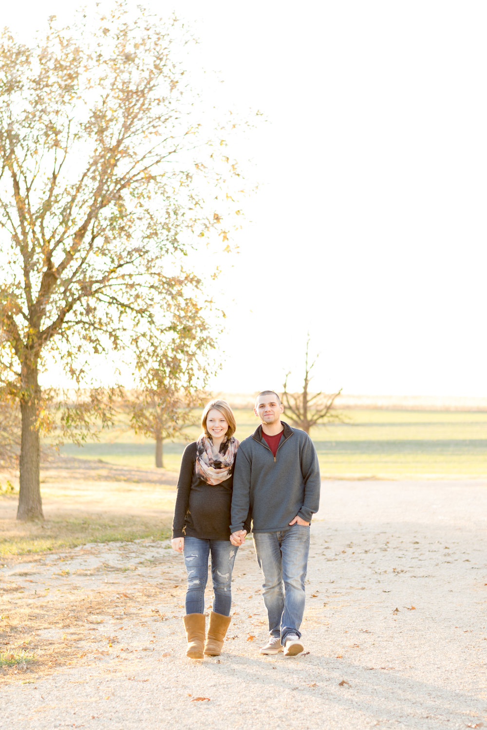 The negative space of the sky overhead creates a balance in this portrait and draws your eyes to the couple in the center of the frame which is what I wanted!
So the next time you are taking pictures you can think about these elements. See if you can intentionally incorporate at least one or two. Its a fun challenge and will make your pictures that much more interesting!
Be on the look out for the next part in this series about the elements of design! What element would you be most likely to try out?
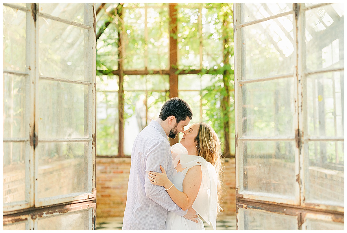

[…] In the first part I talked about the elements of line, scale, color, repetition, and negative space, which you can revisit here. […]